Projects
My portfolio showcases various projects created throughout my career. See my contact information below and get in touch.
University of California, Riverside
-

Things change. Signs for America helped realize the artist, Roy McMakin’s, goals in a large, multidisciplined effort. -

Signs for America constructed a windmill. Can your sign company make a windmill? We can and more. -

Exposing the design and construction was important to the artist. This made an intriguing art display. -

On a cold and windy night, the installation started. Signs for America’s 30-foot trailer was part of the success. -

Equipment, skilled staff, a great vision, and the will and dedication to make it happen are required for these types of projects. -

Here at Signs for America, we do not buy and resell; we fabricate. This means we can do special and unique projects. It also means you are not dependent on a complex supply chain and communication process. Cleaner. Better. Simpler. -

Signs for America has great painting abilities. We use the industry’s best materials for long term durability and color versatility. -

Understanding paint means the correct base layers, such as primers, for adhesion to aluminum are used. -

Unique parts such as these pole caps create a situation that allows for the special look to be realized. -

The buildup of the windmill. In-house fabrication frees YOU to create what you want. -

Signs for America works with Professional Engineers to make safe and unique parts – in this case, poles – for that special look. -

Signs for America welds steel and aluminum in-house. -

This shows structural steel welding. Signs for America is LA Fabricators licensed to guarantee acceptance with the most demanding public works projects. -

Signs for America is big enough for your biggest jobs, but small enough that the fabricator, painter, and project manager work together. Realizing your dream accurately is our end goal and result. -

Signs for America has a hundred ways to install. We can make your project work in the best, most efficient way with our professional installers who will “make it happen”.
Signs forAmericao just completed this project.
UCR’s College of Humanities, newest art addition is an interactive sculpture created by San Diego-based artist Roy McMakin. The message of “Things Change” or “Change Things” will be featured on steel signs mounted on steel poles, and will be scattered around a seating area. This project will make the space between the INTN and Arts buildings an interactive, thoughtful space for students.
Officially titled “Arts Mall: Roy McMakin Art Installation,” covers roughly 5,000 square feet. The sculpture is designed to encourage students and visitors to reflect on their day and the world around them and serves as a marker or entry point for the campus.
https://insideucr.ucr.edu/stories/2020/02/03/art-sculpture-nearing-completion
Latitude 33 Aviation
-

This is the main street entrance. It is interesting to note, the California airports are under the direct control of the counties and not the cities they are located in. This property is controlled by the airport authority. -

Starting with a site visit, Signs for America develops a concept with a difference. Aircraft hangars are not your average strip mall retail outlet. This sign is gigantic – designed to be seen from longer distances and the air. The building construction, available electric supply, access into controlled areas, and difficulty reaching and reinforcing the sign area are all special considerations that come into play. -

The sign itself is aluminum and polycarbonate (Lexan). Polycarbonate is used as a bulletproof “glass”. It is also used in high wind areas such as high-rise buildings. If damage does occur, the debris can do great harm, in this case, to planes and people. -

Deciding on which specific size to use greatly depends on the situation. Most sign ordinances are sized for the distances of the surrounding roadways. Because planes require a lot more space and are looking for navigational aids miles away, these letters are designed for a totally different dynamic. -

Main street entrance illuminated at night -

The best visibility is at night and in low light levels. This is where the wayfinding aspect is so important. Finding the destination quickly and clearly helps clear traffic off of the active taxi ways and runways faster.
Product: Two sets of channel letters
Industry: Aviation & Transportation Services
Signage Solution: Design, build, and install a set of channel letters for their front entrance, along with a second massive set over their hangar.
Black Rock Coffee
-

Having sharp and attractive signage is a business tool that really has no substitute. -
At Signs for America, we make channel letters in-house. We sell to other sign companies as well. By making these in-house, we control the quality and can make a more attractive sign than the others. -

Black Rock was looking for the most effective solution rather than the cheapest solution. -

Blade sign close-up -

While the focus was on the night look and feel, these signs look amazing at any time of day. -

The signs are all bright LEDs and the channel letter sets are backlit. -

An illuminated sign is key to attracting customers in high traffic retail areas. -

Black Rock Coffee’s business depends on the number of cars that pass by. Pulling a high percentage of these travelers into the lot to buy coffee increases profitability. -

Back-lit channel letters closer-up -

Investing in better, distinctive signs than the competition in the area pays for itself with increased sales. -

Black Rock Coffee trusted Signs for America to quickly and professionally design, build, and install their signs. It received cost-effective, fast, and high-quality work.
Client: Black Rock Coffee franchisee
Industry: Restaurant
Signage Solution: We designed, built, and installed Black Rock Coffee electrical signs
Pacific Marine Credit Union – Frontwave
-

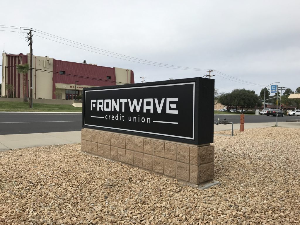
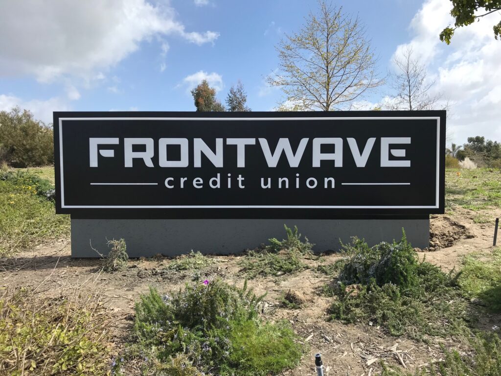
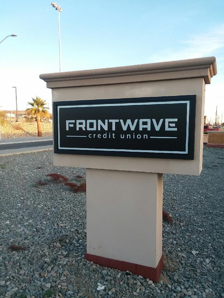
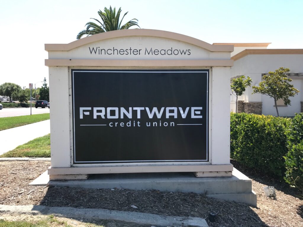
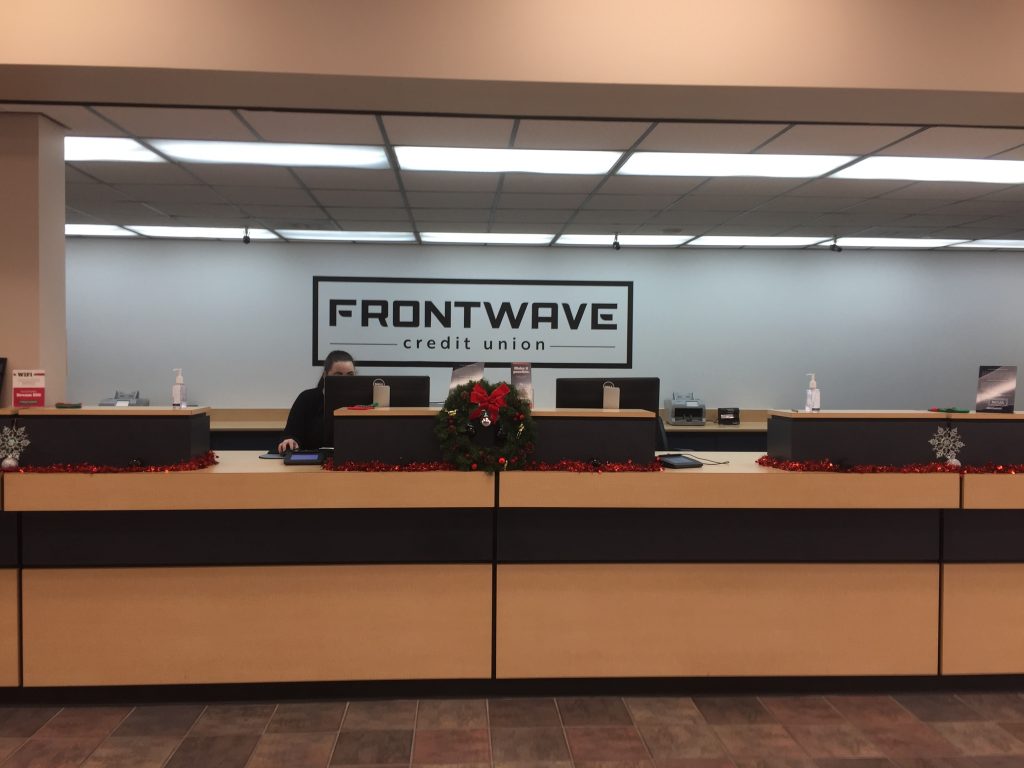
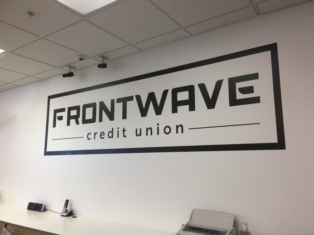
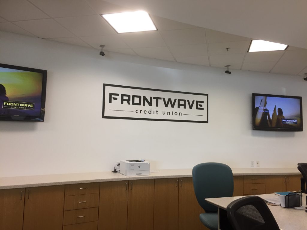
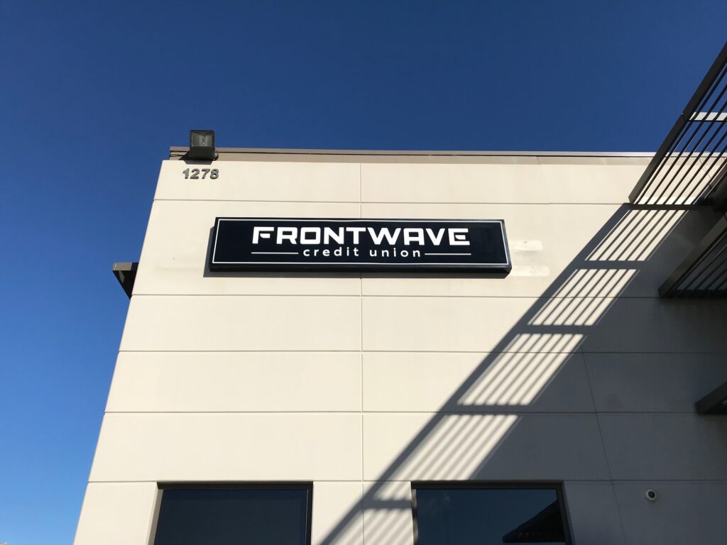
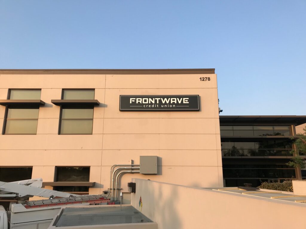
Pacific Marine Credit Union (PMCU) changed its name and brand to Frontwave Credit Union in November 2018, as part of a strategic initiative to differentiate and disrupt the Southern California financial services competitive landscape. -

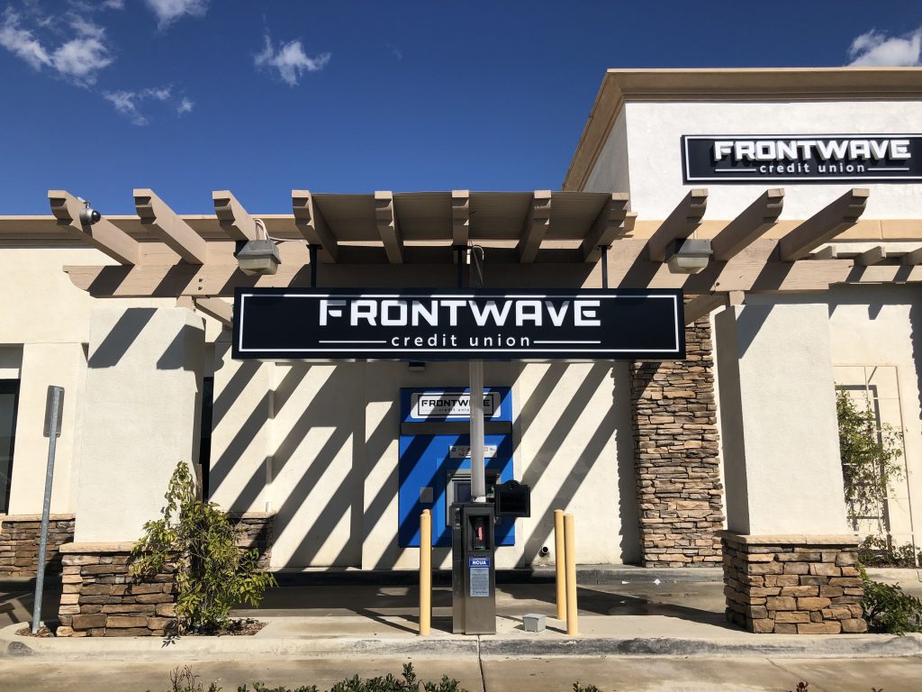
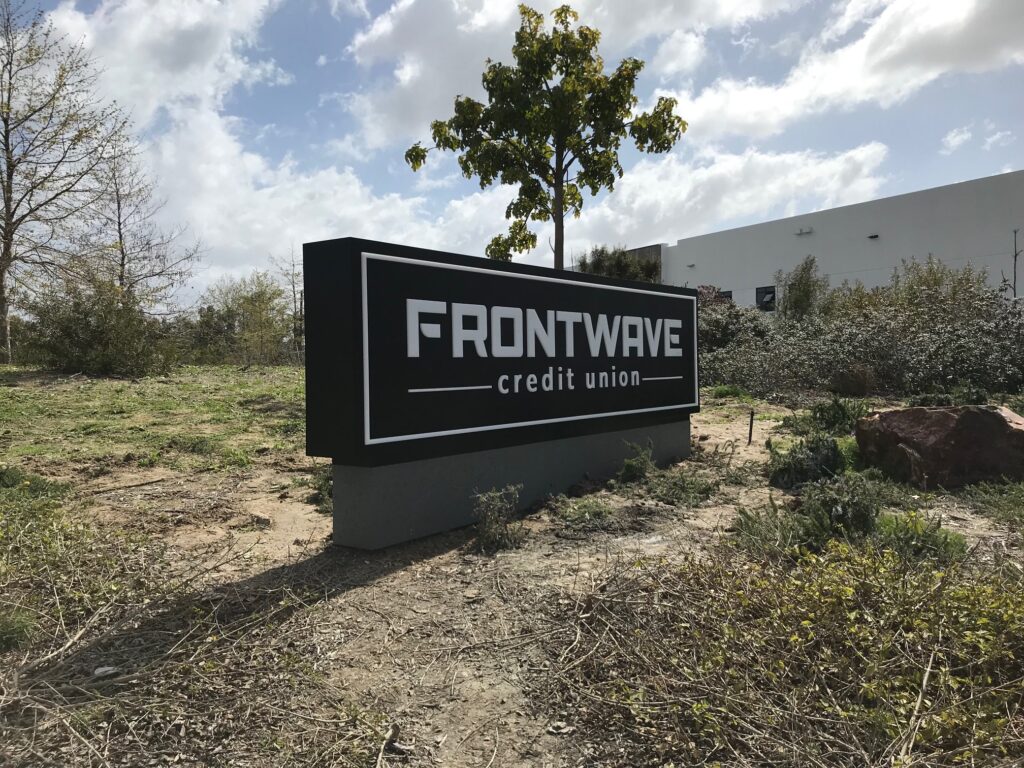
Monuments were needed in several forms. Signs for America took the responsibility to design, manufacture, and install them all. -

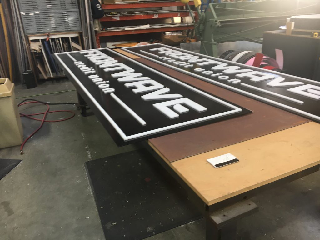
The signs were built from raw metal stock, wired and electrified, and painted before finally planting them on-site. Monuments were needed in several forms. Signs for America took the responsibility to design, manufacture, and install them all. -

-

-

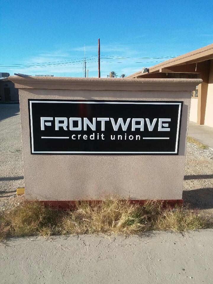
In a couple of cases, we rebuilt existing monuments to save money and salvage past capital expenses. -

Some signs required a new face for an existing monument, as shown in the last image. These are unique faces but fit into existing formats. -

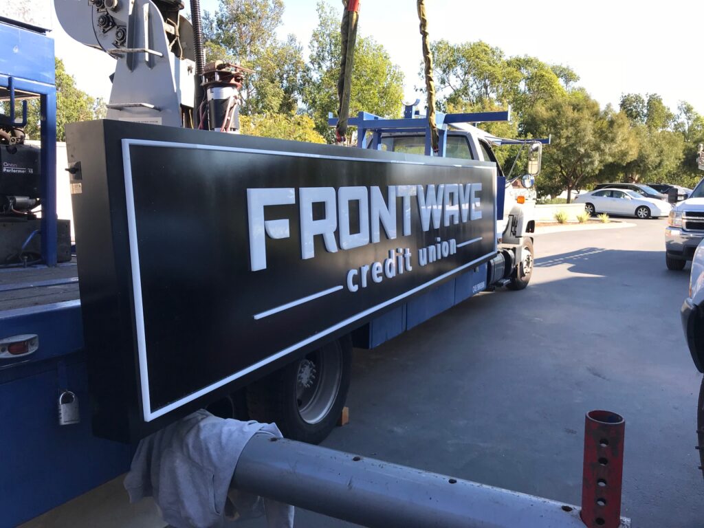
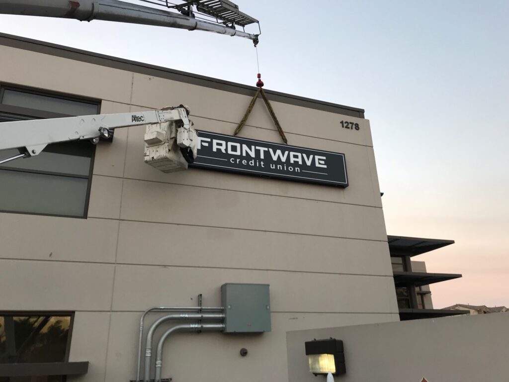
The brand transformation required new signs for the new branding, and PMCU selected Signs for America over a larger national sign company to do the job. -

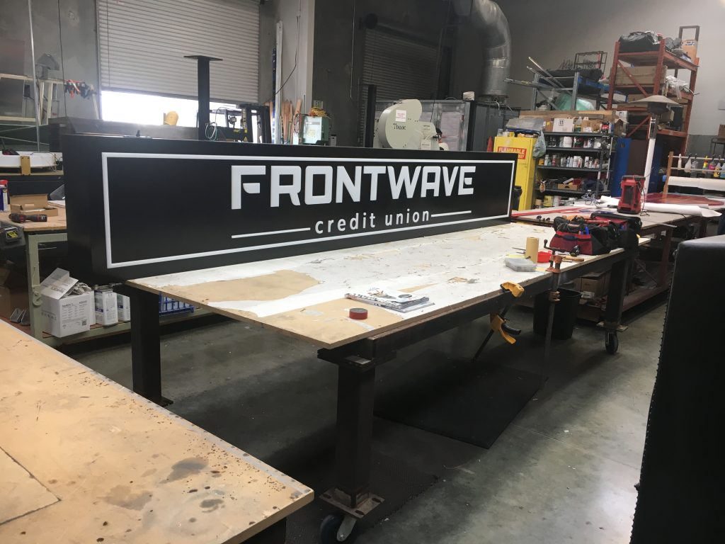
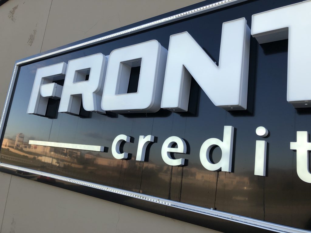
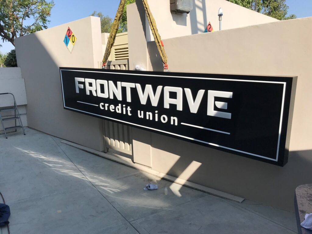
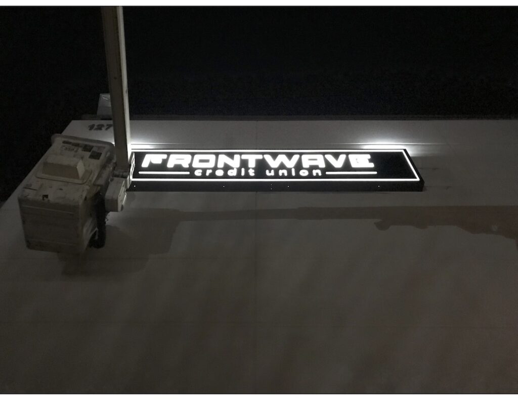
This sign is uses traditional channel letters for “Frontwave”, acrylic milled into the shapes for “credit union”, and an extrusion for the perimeter. This hybrid was the technique needed to realize Frontwave’s vision for the brand. -

Signs for America built these in volume and with 100% in-house equipment and personnel. -

-

-

-

-

-

-

-

-

-

Frontwave trusted Signs for America to quickly and professionally rebrand 14 branches. It was cost-effective, fast and high-quality work.
Client: Pacific Marine Credit Union
Locations: 14 branch locations
Industry: Credit Union / Banking
Signage Solution: We designed, built, and installed all electrical signs for 14 branch locations.
TEGNA
-

TEGNA’s new headquarters space includes a 25-foot LED display wall on the 20th floor, a three-story interior staircase going from the 19th floor to the rooftop lounge, and TEGNA to Go, its own private market with fresh food and drinks. -

This mural is indoors, yet visible from the highway through windows spanning for three stories. -

Signs for America carefully anchored and stretched a flex face over the frame to create a flat, tight face to showcase the message. -

This mural was not a sign that could be made in a shop and lifted into place; it must be assembled in-place. Signs for America built this sign using the wall. -

The face of the mural was a special translucent material called a flex face. The print on the flex face was shipped in a roll which was anchored at the top and rolled down. -

Behind the scenes, Signs for America used about 1000 LEDs in 30 rows, all powered with a series of power supplies. Each row was on a base with each row offset from the previous. -

Signs for America framed the area with a set of custom extruded aluminum frame. The wall was painted to reflect light. -

That’s a lot of LEDs! -

The project required a lot of planning, careful selection of materials and a lot of work, but the end result was a spectacular realization of TEGNA’s project.
Product: 3 story mural in high-rise
Location: Tysons Corner, VA
Industry: Media broadcasting company
Signage Solution: Create a 27 foot high mural on the 18th, 19th and 20th story of an office building.
The Picerne Group – Blu Laguna Niguel
-

Two sets of 5-foot tall channel letters sit mounted to the top of the Blu building. They are called halo letters with lights on the back to create a glowing “halo” effect. -

Two monument signs known as “wayfinders” set the tone of the entire project. They were made using welded aluminum tubular construction with acrylic “push through” backlight letters. -

We built the monuments in-house, excavated the footers, poured the concrete bases, and installed both. -

-

-

-

-

Wayfinding Signs: Built to match the Unit IDs, the hallways are full of “directionals” to help tenants and visitors alike. -

Evacuation Maps: Each map is unique to the location mounted to guide people specifically in case of emergency egress. They were also designed to match the Blu colors and style. -

ADA Compliant Signage: We design, build and install signs with tactile text and braille as well. In Blu’s case, we made over 232 Unit IDs with integrated doorbells . -

In addition, we built more economical generic signs for the utility areas to comply with the ADA requirements and the fire code. -

All production was done in-house with our CNC router, Gravograph engraver, and in-house painting ability. -

Interior Signs: We designed, built, and installed many interior signs: This sign is huge, standing at 5-feet by 10-feet. It is at eye level and is flawless. We CNC router cut all the letters from flat stock and use a laminate for the background to match the interior details and doors of the building.
Client: Picerne
Industry: Multifamily
Signage Solution: All Signs: 39 types from Channel letters and Monuments to ADA Interior and Wayfinding. Over 700 signs in total.
Home Depot
A description of the project and the works presented.
