Pacific Marine Credit Union rebrands to Frontwave
Client: Pacific Marine Credit Union
Locations: 14 branch locations
Industry: Credit Union / Banking
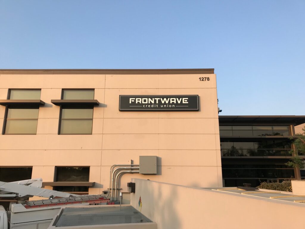
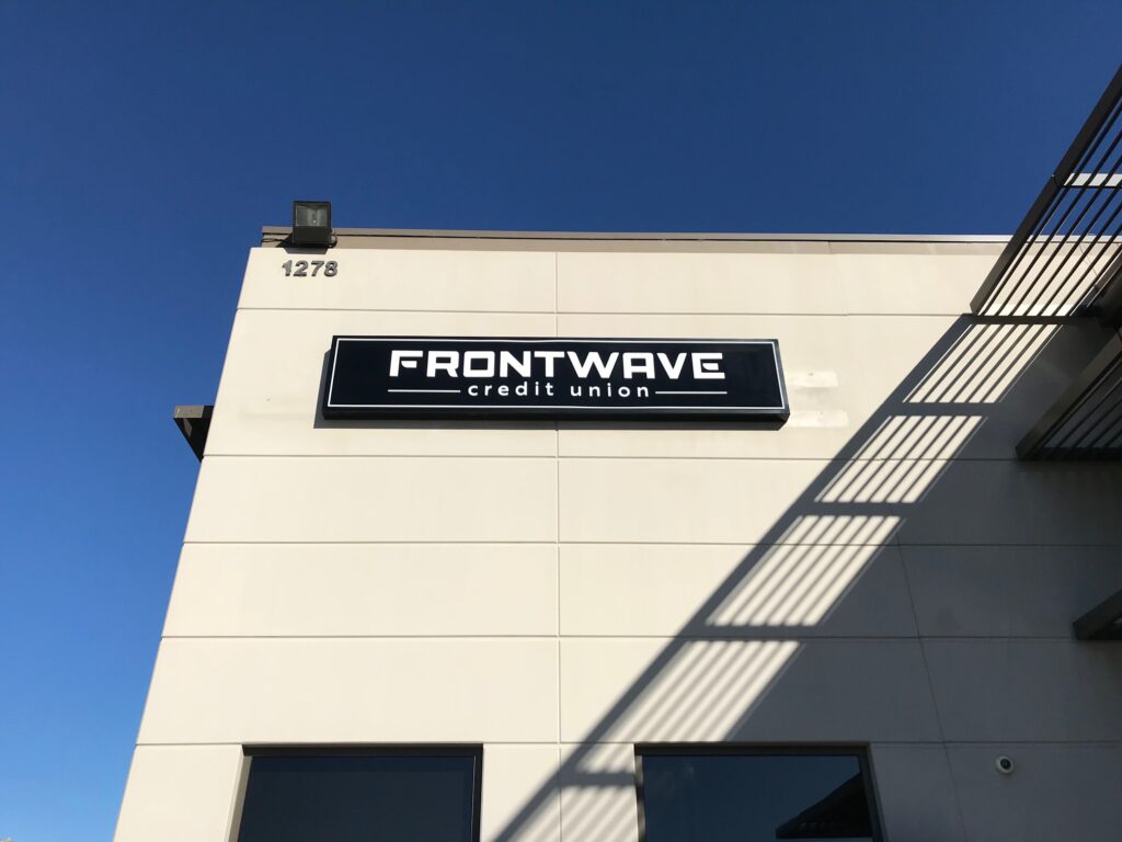
Signage Solution: We designed, built, and installed all electrical signs for 14 branch locations.
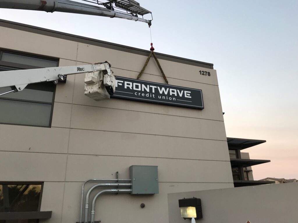
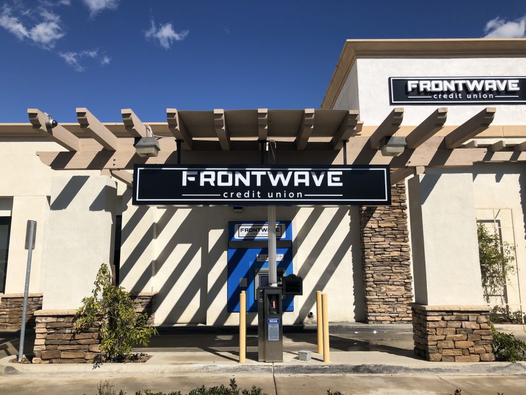
Pacific Marine Credit Union (PMCU) changed its name and brand to Frontwave Credit Union in November 2018, as part of a strategic initiative to differentiate and disrupt the Southern California financial services competitive landscape. The transformation required new signs for the new branding, and PMCU selected Signs for America over a larger national sign company to do the job.
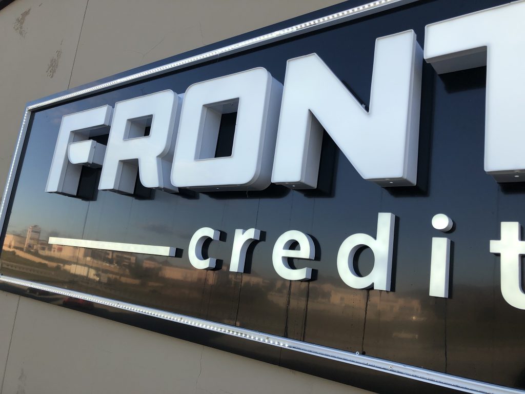
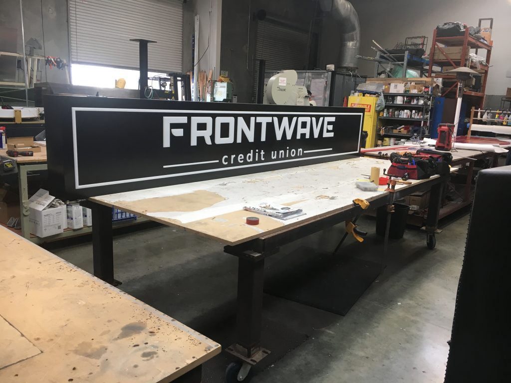
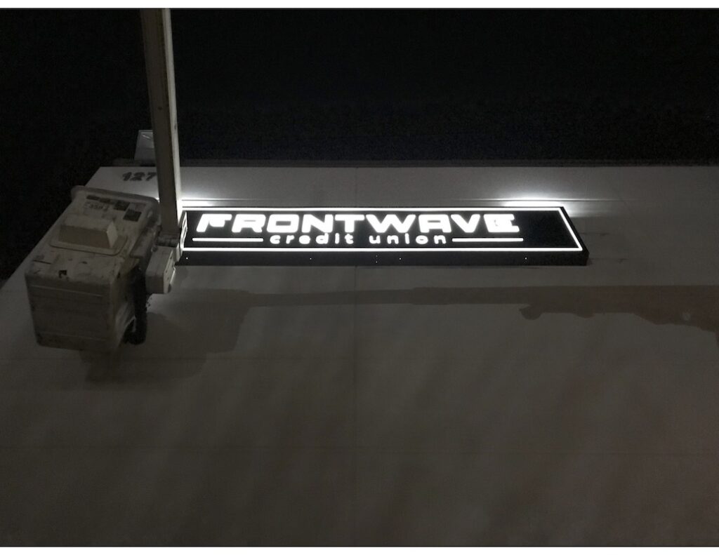
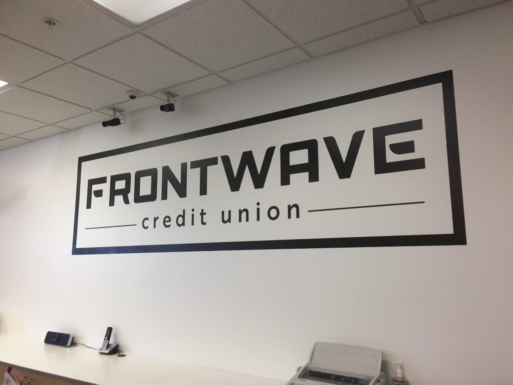
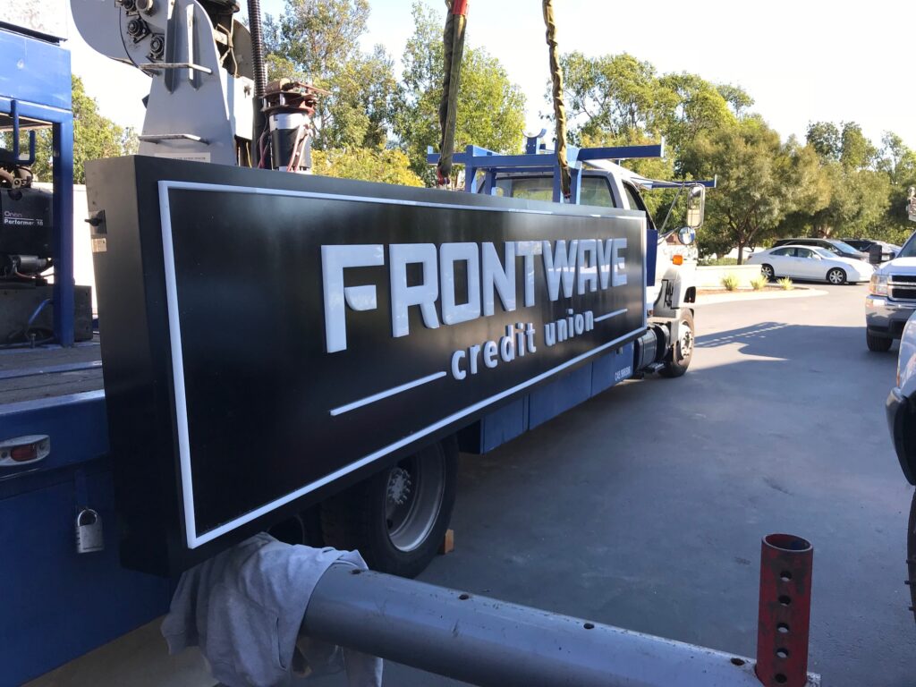
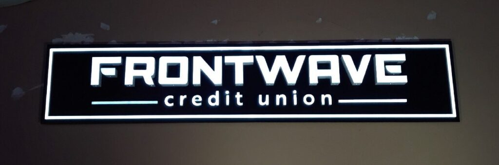
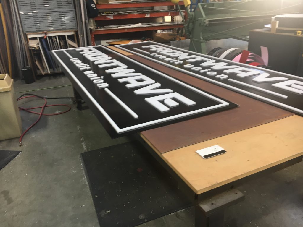
Signs for America routinely builds channel letters. This sign is special, using traditional channel letters for “Frontwave”, acrylic milled into the shapes for “credit union”, and an extrusion for the perimeter. This hybrid was the technique needed to realize Frontwave’s vision for the brand.
Signs for America built these in volume and with 100% in-house equipment and personnel.
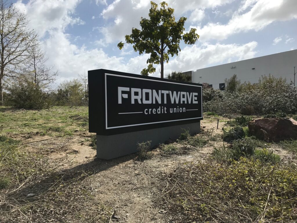
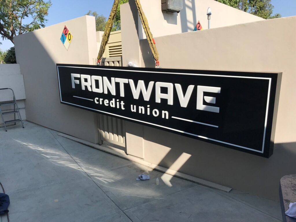
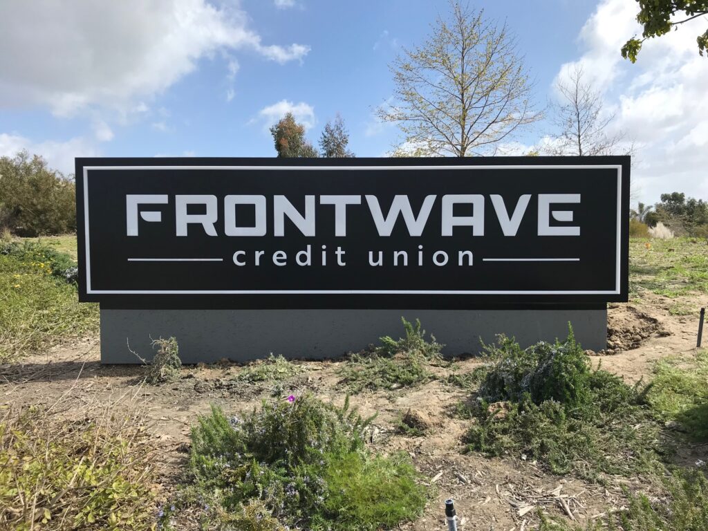
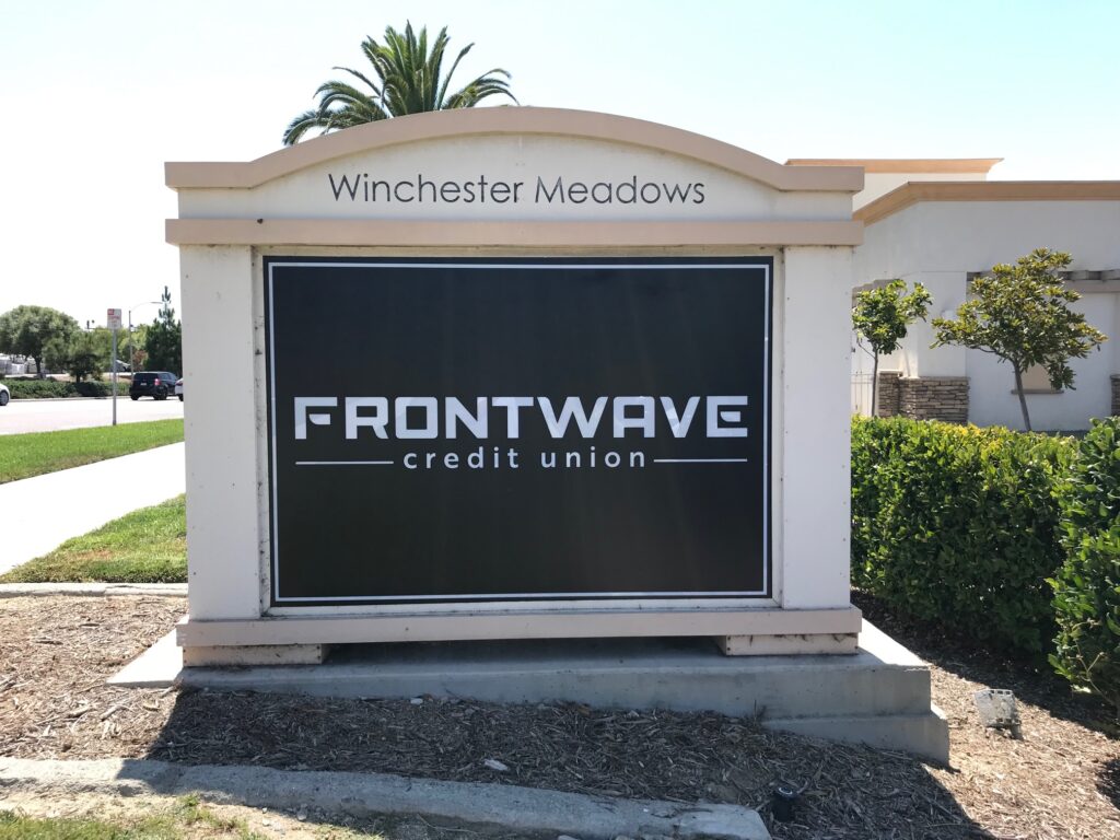
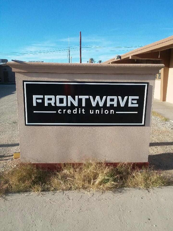
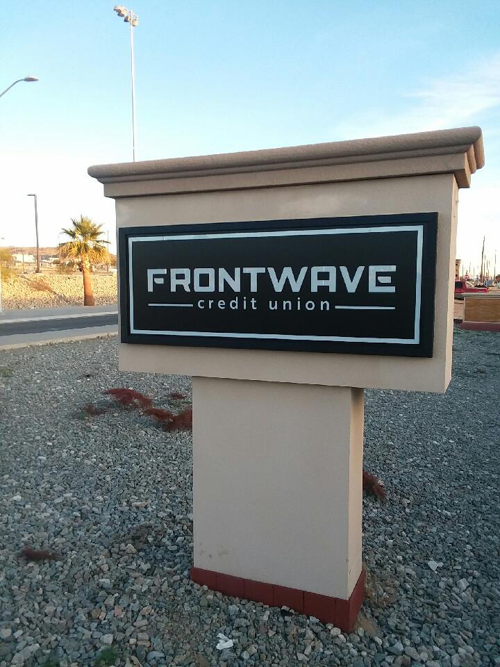
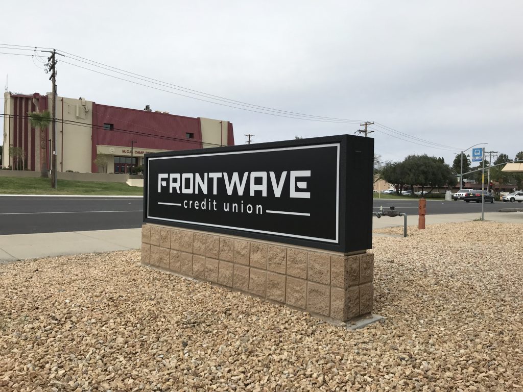
Monuments were needed in several forms. Signs for America took the responsibility to design, manufacture, and install them all. The signs were built from raw metal stock, wired and electrified, and painted before finally planting them on-site.
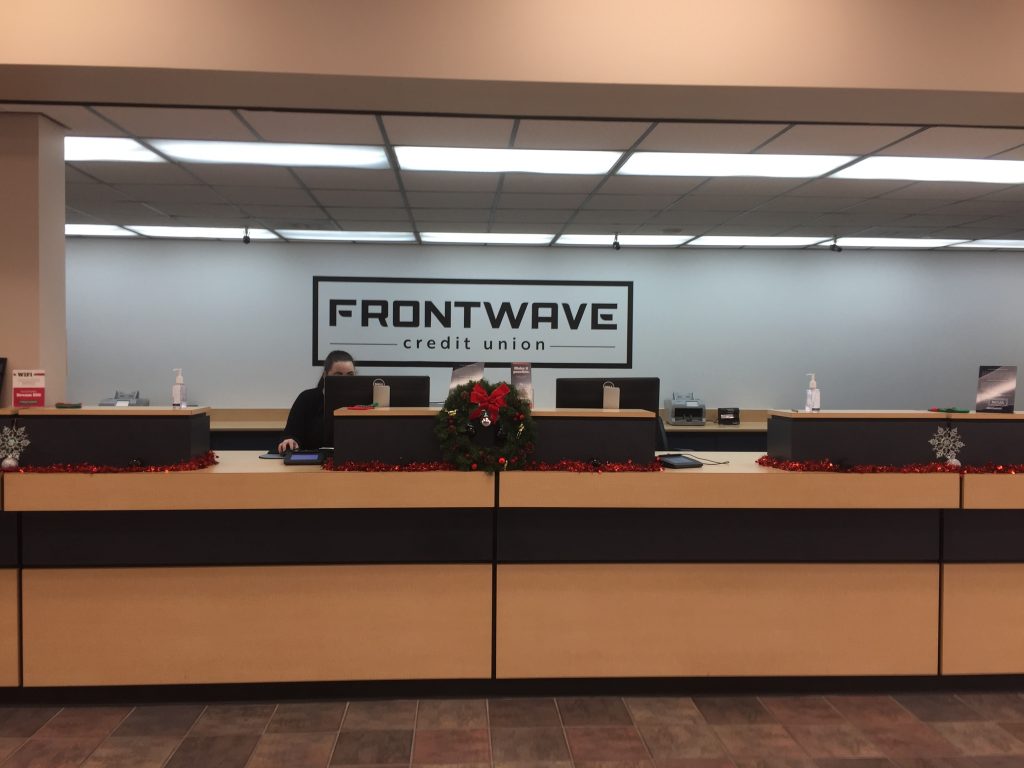
Others required a new face for an existing monument, as shown in the last image. These are unique faces but fit into existing formats.
In a couple of cases, we rebuilt existing monuments to save money and salvage past capital expenses.
Frontwave trusted Signs for America to quickly and professionally rebrand 14 branches. It was cost-effective, fast and high-quality work.
Can we help you rebrand or expand in the same way?